|
| Structure | Tips | Theory | WebPoems | Workshops | Books | Articles | Lisa | Jonathan |
Tips |
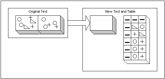
Convert repeating info to tables. | ||||||||||||||||||||||||||||||||||||||||||||||||
 Background: Background:
A table can present data more concisely than text can, and it is more accurate than graphic presentations. … A table facilitates comparisons among data because of the arrangement of the data into rows and columns. Overall trends about the information, however, are more easily seen in charts and graphs. —Brusaw, Alred, & Oliu (1997) The conventional sentence is a poor way to show more than two numbers because it prevents comparisons within the data. Tables are preferable to graphics for many small data sets. … Tables also work well when the data presentation requires many localized comparisons. —Tufte (1983) Original Paragraph:Steel shipments rose dramatically during the first five years of this decade, then declined over the last three years, as estimated by the American Steel Institute. Steel used for automobiles rose from 14,610,000 short tons, in 1990, to 20,123,000 in 1995, and if trends continue, will dip to 14,475,000 for 1998, putting us behind the high point of 1990. Similarly, steel for construction rose from 9,664,000 tons in 1990 to 11,836,000 tons in 1995, then sank below 1990 levels, in estimates for 1998. Other market sectors showed 1998 slightly ahead of 1990, but still substantially behind 1995. For instance, rail manufacturers of freight cars and passenger cars bought 2,525,000 short tons of steel in 1990, then bought 3,805,000 short tons in 1995, and only 3,098,000 in 1998. The only sector showing an advance over 1995 levels are the growing number of steel distributors, who bought 11,125,000 short tons in 1990, then moved up to 14,813,000 short tons in 1995, and soared to 16,025,000 short tons in 1998. 167 words. Revised paragraphs:Steel shipments rose dramatically from 1990 to 1995, then fell in most market categories to levels below 1990 (in autos, and construction), or at least below the swollen figures of 1995 (railroad cars). The only group that continued to increase shipments beyond the highs of 1995: steel distributors.
Inspiration: Challenge: Withdraw data and put it into a table, then write a brief summary. Tufte measured what he calls data density (numbers per square inch) in the statistical graphics in various science journals. He found, for instance, that Nature’s tables showed a minimum of 3 numbers per square inch (not good), a maximum of 362 (much better), and a median of 48 (pretty good, as a median). Science, however, had a minimum of 5, and a maximum of 44, with a median of 21—not nearly as dense as Tufte would approve. The New England Journal of Medicine had a minimum of 3, and a magnificent maximum of 923, but fell to a median of 12—a severe disappointment. Two newspapers, and one business journal outdid the medical journal. The Wall Street Journal had the best median of this group, with 19 numbers per square inch; both Fortune and the London Times came close behind, with 18. Interestingly, the worst newspaper on Tufte’s list, the old Commie outlet Pravda, had a maximum of one number per square inch, a minimum of 1/10th of a number per square inch, for a median of 0.2 numbers per square inch. Overinflated. So there is often a wide variation within each publication, but overall, "the average published graphic is rather thin."
See: Brusaw, Alred, & Oliu (1997), Horton (1990), Tufte (1983) (September 1, 1998)
Other tips on brevity:
|
|||||||||||||||||||||||||||||||||||||||||||||||||
| List of web sites, research articles, and textbooks used to develop the tips. | |||||||||||||||||||||||||||||||||||||||||||||||||
Services/Tips/Theory/WebPoems/Workshops/Books/Articles/Lisa/Jonathan
Copyright 1998 Jonathan and Lisa Price, The Communication Circle
Return to our site at http://www.theprices.com
Email us at JonPrice@AOL.com